Paint color stands as one of the most powerful and cost-effective tools in interior design, capable of completely transforming your living room’s atmosphere, mood, and perceived dimensions with a single weekend project. The right paint color can make small spaces feel expansive, dark rooms appear brighter, and ordinary walls become stunning architectural features that anchor your entire design scheme. Beyond mere aesthetics, your chosen paint color profoundly influences how you feel in the space—warm hues create cozy intimacy perfect for family gatherings, cool tones promote calm relaxation ideal for unwinding after long days, and bold colors inject energy and personality into your daily living environment that reflects your unique style.
Selecting the perfect living room paint color requires understanding how natural light, artificial illumination, existing furnishings, and architectural features interact with different hues throughout the day and across seasons. Colors that appear perfect on small paint chips can look dramatically different when applied to entire walls, shifting with morning sunlight, afternoon shadows, and evening lamplight in ways that surprise even experienced designers. This complexity makes paint selection both challenging and exciting, offering endless opportunities for creative expression while demanding careful consideration of undertones, sheens, finish quality, and how colors complement your furniture, flooring, window treatments, and decorative accessories to create cohesive, harmonious spaces.
In this comprehensive guide, we’ll explore fifteen distinctive living room paint color ideas ranging from warm terracotta and cheerful butter yellow to sophisticated navy blue and dramatic charcoal gray. Each concept demonstrates how specific paint colors work in real living spaces, paired with complementary furnishings, strategic lighting approaches, and thoughtful styling that maximizes each color’s potential. Whether you’re drawn to serene neutrals like greige and taupe, nature-inspired greens in sage and olive, romantic blush tones, or bold statement walls in emerald and black, you’ll discover practical inspiration and expert insights to confidently transform your living room with the perfect paint palette that expresses your personal aesthetic while creating the atmosphere you desire.

1. Mediterranean Warmth with Terracotta Walls
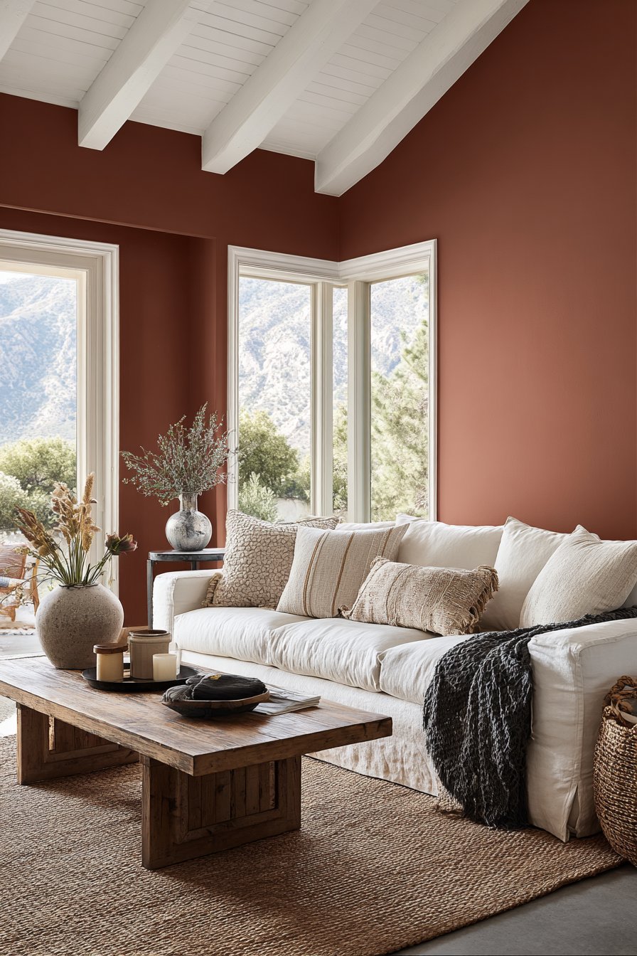
Warm terracotta walls create an inviting Mediterranean atmosphere that envelops your living room in earthy, sun-baked warmth reminiscent of Italian villas. The subtle texture adds dimensional interest while rich orange-red undertones bring instant coziness. A cream-colored linen sofa provides perfect neutral grounding while a natural jute rug anchors the seating area with organic texture.
White trim and ceiling create essential crisp contrast while a natural wood coffee table adds organic warmth. Large windows allow soft natural light to enhance the rich paint color throughout the day, with morning sun making the terracotta glow and afternoon light revealing its depth.
- Choose terracotta paint with subtle texture for Mediterranean authenticity
- Balance bold warm walls with cream upholstery to prevent overload
- Use crisp white trim to define space and add contrast
- Incorporate jute rugs and wood furniture to complement earthy tones
- Position in rooms with abundant south-facing natural light

2. Sophisticated Navy Blue Accent Wall
A sophisticated navy blue accent wall behind a grey velvet sofa creates dramatic focal point that anchors the seating area with confident color. The deep blue provides striking backdrop while the remaining three walls painted in soft white maintain balance. Brass floor lamp and gold-framed mirror reflect light while their warm metallic finishes complement the cool blue.
Natural oak flooring grounds the space with organic warmth. Soft diffused daylight from side windows highlights the depth and richness of the navy paint, revealing subtle undertones that shift from deep blue to almost black depending on lighting angles.
- Paint only one accent wall in navy to create focal point without overwhelming
- Pair navy walls with grey upholstery for sophisticated depth
- Add brass accents to warm the cool blue palette
- Keep remaining walls white for balance and brightness
- Choose matte or eggshell finish for rich color saturation

3. Serene Sage Green Throughout
Serene sage green throughout all walls evokes natural calm in this modern farmhouse setting, bringing tranquility of nature indoors. The monochromatic approach creates seamless flow while the white shiplap fireplace surround and cream upholstered armchairs provide subtle contrast. Light wood floors and woven baskets add textural interest and organic warmth.
Abundant natural light from multiple windows demonstrates how the muted green appears in various conditions—more grey in shadows and more green in direct sunlight. This chameleon quality makes sage green incredibly versatile.
- Use sage green on all walls for cohesive calm atmosphere
- Add white architectural elements for crisp contrast
- Choose cream upholstery for softer coordination
- Incorporate light wood tones for organic texture

4. Classic Greige Versatility
Classic Benjamin Moore Revere Pewter greige demonstrates the perfect warm gray that works beautifully in both natural and artificial light. This balance of grey and beige appears warm grey in sunlight and cooler in shadow. Charcoal grey sofa and white built-in bookcases frame the space while medium-toned hardwood flooring adds warmth.
Table lamps with cream shades provide evening illumination that enhances the paint’s warm undertones. The versatile neutral works throughout the day, complementing virtually any furniture style.
- Choose proven greige colors like Revere Pewter
- Test samples across different times of day
- Pair greige walls with warm and cool furniture
- Add white built-ins for architectural definition
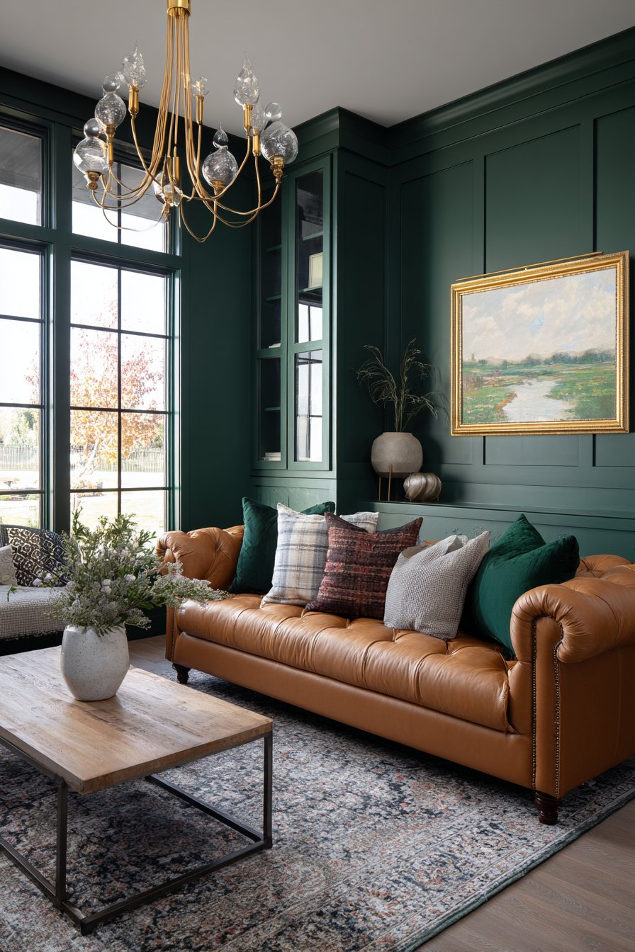
5. Bold Emerald Green Statement
Bold emerald green accent wall with matte finish creates luxurious backdrop for a cognac leather sofa. The deep green provides rich, saturated drama while remaining sophisticated. Remaining walls in warm white balance the dramatic choice while brass chandelier and velvet throw pillows enhance the rich selection.
Natural light from large windows reveals the paint’s depth and dimension, showing how emerald green shifts from deep forest to vibrant jewel tone depending on sun angles.
- Use emerald green on single accent wall for maximum impact
- Choose matte finish for sophisticated richness
- Pair with cognac leather for warm contrast
- Add brass lighting to complement jewel tones

6. Bright Warm White Walls
Warm white walls with subtle cream undertones create bright Scandinavian-inspired space that maximizes light while avoiding stark coldness. The light grey sectional and pale wood furniture maintain the luminous feel. White painted brick fireplace adds texture without introducing new color.
Sheer curtains allow maximum natural light, essential to the Scandinavian aesthetic. The warm white maximizes brightness while soft shadows add depth.
- Choose warm white with cream undertones
- Layer white and cream furniture for subtle depth
- Add textured white elements for dimensional interest
- Use sheer curtains to maximize natural light
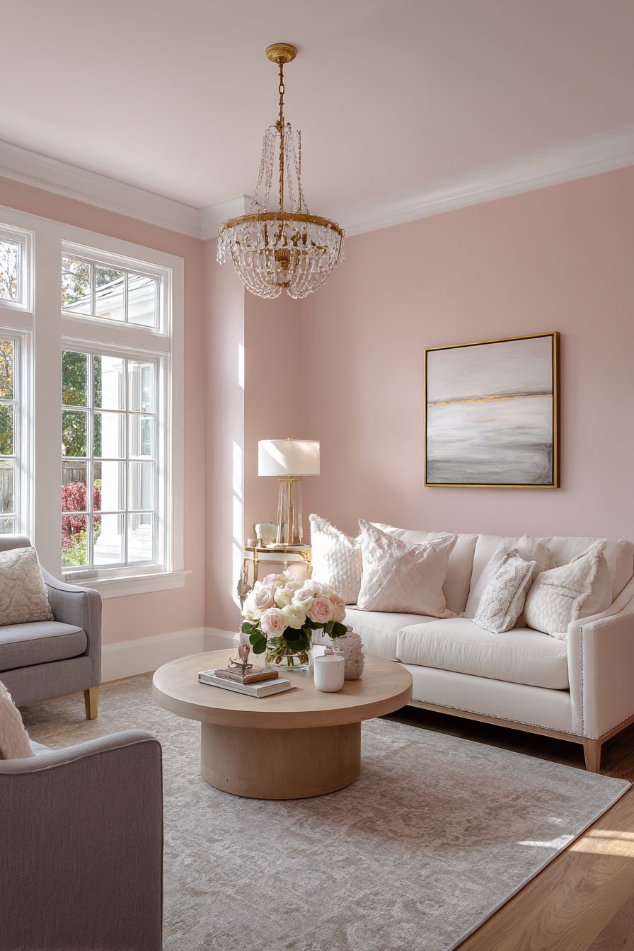
7. Romantic Blush Pink
Soft blush pink walls create romantic yet sophisticated atmosphere, proving pink can be elegant in muted tones. The ivory sofa and light grey armchair provide neutral grounding. White crown molding adds architectural detail while natural oak coffee table and brass accents complement the warm pink tone.
Golden hour lighting shows how the blush paint shifts from peachy to mauve throughout the day, demonstrating its complex character.
- Choose dusty blush pink for sophistication
- Balance with grey and ivory furniture
- Add white molding for crisp definition
- Incorporate brass accents to warm the palette

8. Moody Charcoal Gray Drama
Deep charcoal gray walls create moody, intimate space balanced with abundant white trim and ceiling. Light grey linen sectional and marble coffee table prevent the room from feeling too dark. Multiple light sources including recessed lighting, floor lamps, and table lamps ensure proper illumination.
Large window with white curtains brings essential natural light. The dramatic paint creates cozy atmosphere while strategic light-colored elements maintain livability.
- Paint trim and ceiling bright white with dark walls
- Choose light furniture to balance dark walls
- Install multiple light sources
- Ensure adequate windows with white treatments

9. Cheerful Butter Yellow
Soft butter yellow walls evoke cheerful traditional cottage style that brings instant sunshine. White wainscoting adds classic architectural interest while floral chintz sofa and blue accent pillows complement the sunny choice. Natural light from bay windows enhances the warm, inviting tone.
The gentle yellow creates welcoming atmosphere without overwhelming, demonstrating how softer yellows work better than bright primary yellow in living rooms.
- Choose soft butter yellow rather than bright primary
- Add white wainscoting for traditional detail
- Pair with blue accents for classic harmony
- Position in rooms with good natural light

10. Classic Two-Tone Treatment
Classic two-tone approach with upper walls in soft grey and lower portion in crisp white creates architectural dimension. The horizontal division adds visual interest while navy blue sofa and traditional area rug anchor the space. White painted built-ins integrate seamlessly with the lower white section.
Natural and lamp lighting demonstrate how the two-tone treatment adds sophistication and perceived height to standard rooms.
- Divide walls horizontally with chair rail
- Paint lower third white and upper two-thirds in color
- Choose grey for versatile neutral
- Coordinate built-ins with lower white section

11. Earthy Olive Green
Earthy olive green walls create sophisticated organic feel, bringing nature-inspired depth. Tan leather sofa and natural fiber rug complement the organic choice while black metal accents and indoor plants enhance the palette. Large windows flood the room with light revealing the paint’s complex undertones.
This olive green demonstrates how nature-inspired colors work beautifully with natural materials, creating cohesive spaces connected to the outdoors.
- Choose olive green for sophisticated alternative to bright greens
- Pair with tan leather for warm contrast
- Add black metal for contemporary edge
- Incorporate indoor plants to enhance nature palette

12. Soft Coastal Powder Blue
Soft powder blue walls establish calm coastal-inspired atmosphere. White slipcovered sofa and bleached wood coffee table maintain the light, breezy feel while jute rug and woven baskets add natural texture. Sheer white curtains filter bright light making the blue appear soft and ethereal.
The gentle blue creates relaxed elegance that works year-round, bringing vacation-home serenity to everyday living.
- Choose powder blue for sophisticated coastal feel
- Pair with white slipcovered furniture
- Add bleached wood for beachy texture
- Use jute rugs to ground light blue walls

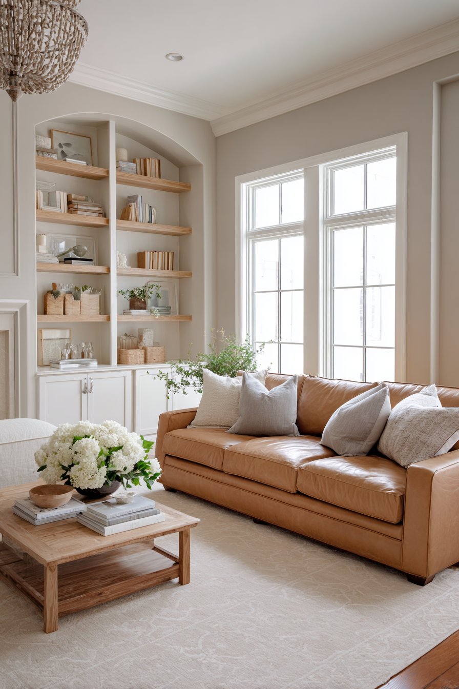
13. Versatile Warm Taupe
Warm taupe walls provide versatile neutral backdrop that works with multiple decor styles. Cream sectional and dark wood media console create tonal layering while white fireplace mantel provides contrast. The mix of natural and artificial lighting shows the paint’s warmth and adaptability throughout the day.
This sophisticated neutral bridges warm and cool tones effectively, coordinating easily with existing furniture and accessories.
- Choose warm taupe for versatile neutral
- Layer cream and dark wood for tonal depth
- Add white architectural elements for contrast
- Test in both daylight and lamplight

14. Dramatic Black Accent Wall
Dramatic black accent wall behind modern white sofa creates bold graphic statement. Three remaining walls painted bright white maintain light while the single black wall provides striking focal point. Chrome floor lamp and glass coffee table keep the look contemporary while large windows ensure ample natural light.
This high-contrast scheme requires careful balance but creates stunning modern drama when executed properly.
- Use black on single accent wall only
- Paint remaining walls bright white for balance
- Choose white furniture to contrast dramatically
- Ensure large windows and multiple light sources
15. Perfect Greige in Accessible Beige
Soft greige walls in Sherwin Williams Accessible Beige demonstrate perfect neutral combining gray and beige. Camel leather sofa and cream area rug create warm tonal palette while white built-in shelving adds dimension. Natural window light throughout the day shows the paint’s chameleon quality—appearing warmer with morning sun and cooler in afternoon shadows.
This beloved neutral works beautifully in virtually any home with any decor style while maintaining sophistication and warmth.
- Choose Accessible Beige for proven greige
- Pair with camel leather for warm sophistication
- Add white built-ins for architectural definition
- Observe how greige shifts throughout the day
Why These Living Room Paint Color Ideas Excel
These fifteen living room paint color ideas demonstrate the transformative power of thoughtful color selection across the full spectrum from warm neutrals to bold jewel tones, each carefully chosen to illustrate specific design principles and color theory applications. The terracotta walls and butter yellow create inviting warmth perfect for cozy family gatherings and traditional cottage aesthetics, while navy blue and emerald green accent walls prove that bold colors work beautifully when properly balanced with white walls and complementary furnishings. The sage green and olive green options showcase nature-inspired palettes that bring organic calm and biophilic connection to indoor spaces, while powder blue offers breezy coastal serenity that feels relaxed yet sophisticated year-round.
The neutral paint colors—including Benjamin Moore Revere Pewter greige, Sherwin Williams Accessible Beige, warm taupe, and warm white—demonstrate why versatile neutrals remain perennially popular choices, adapting seamlessly to changing light conditions throughout the day while complementing diverse furniture styles from traditional to contemporary. The blush pink proves pastels can be sophisticated when chosen in muted tones, while the two-tone treatment shows creative approaches to traditional paint application that add architectural interest. Meanwhile, charcoal gray and black accent walls demonstrate how dark colors create sophisticated drama and moody intimacy when properly balanced with abundant white trim, light-colored furnishings, and adequate natural light from generous windows.
What makes these paint color ideas particularly valuable is their real-world applicability and practical demonstration of how specific colors work with natural lighting, furniture pairings, and architectural elements in actual living spaces rather than idealized studio settings. The consistent emphasis on understanding undertones, observing lighting conditions at different times of day, and selecting complementary furnishings provides actionable guidance that goes far beyond simple color selection, ensuring readers can achieve successful, professional-quality results in their own homes regardless of their prior design experience or budget constraints.
Conclusion
Choosing the perfect living room paint color represents one of the most impactful design decisions you’ll make, affecting your space’s mood, perceived size, and overall aesthetic for years to come. These fifteen paint color ideas demonstrate that successful color selection goes beyond simply choosing a pretty swatch—it requires understanding how colors interact with natural light throughout the day, how undertones affect compatibility with existing furnishings, and how bold versus neutral choices impact your space’s character and long-term versatility. The interplay between paint color, lighting, furniture, and architectural elements creates the overall atmosphere, making careful consideration of each factor essential to achieving professional results.
From warm, inviting terracotta and cheerful butter yellow to sophisticated navy blue and dramatic charcoal gray, the perfect paint color awaits to transform your living room into a space that truly reflects your personal style while creating the atmosphere you desire for daily living. Consider testing large samples on your walls, observing them in morning, afternoon, and evening light before committing to final color choices. Don’t fear bold color choices if they speak to your aesthetic—proper balance with neutral furnishings, adequate lighting from multiple sources, and strategic white trim makes even dramatic hues livable and sophisticated in residential settings.
Whether you choose versatile greige neutrals like Revere Pewter or Accessible Beige that adapt to changing decor, nature-inspired greens in sage or olive that bring outdoor calm indoors, or confident jewel tones like emerald that make bold statements, your living room paint color sets the foundation for a space you’ll love living in for years to come. Start with these inspiring ideas, adapt them to your unique space constraints and personal style preferences, and prepare to fall in love with your beautifully transformed living room that welcomes family and friends while expressing your individual design sensibility.

Andrew is the founder and lead writer at RoomBlossom, a home decor publication dedicated to practical, intentional interior design. With over 10 years of hands-on experience transforming real-world living spaces — from compact apartments to full attic conversions — Andrew specialises in room design that balances visual appeal with everyday function. His work spans living rooms, bedrooms, sunrooms, and attic spaces, always guided by the belief that great design should work for the people who live in it, not just look good in photographs.